
Color psychology for custom banners shapes how brands influence attention, perception, and action. Understanding banner color psychology helps you craft visuals that reduce cognitive load and guide users toward the CTA. By applying color theory for banners, you can build palettes that improve readability, conversion, and support CTA color testing. Maintaining brand color consistency across banners reinforces recognition and boosts CTR optimization color signals. Together, these elements create banner designs that are not only attractive but also purposeful, scalable, and measurement-ready.
Beyond the headline, hue messaging and palette psychology for marketing banners offer practical ways to steer interpretation and response. Think in terms of banner hue messaging, color cueing in ads, and the language of color that supports action. This approach leverages color theory concepts, contrast, and brand tone to build a cohesive visual narrative across placements. Using a consistent color language aligns with brand guidelines, helping recognition grow and engagement improve. In practice, teams experiment with CTAs, backgrounds, and typography to optimize clicks without compromising brand values.
Color psychology for custom banners: How color choices drive clicks
Color is not only decoration in banners; it is a communication channel that shapes first impressions, guides eye movement, and can nudge viewers toward the call to action. By aligning color choices with the message and the audience, you can improve readability and signal value quickly. This is the idea behind banner color psychology: color choices that reinforce intent and reduce friction.
To implement effectively, start by defining the objective and audience, then map color roles such as background, text, CTA, and accent. Use a color palette that aligns with your brand color consistency and supports CTR optimization color strategies. Consider color theory for banners to balance contrast and harmony so the CTA stands out while the rest stays cohesive.
Color theory for banners: Essentials to boost readability and conversions
Color theory for banners is not about random hues; it is about relationships that improve legibility and impact. Ensure strong contrast so text pops, use harmony to keep the design cohesive, and select accent colors to guide the eye toward the CTA. Applying these principles helps maintain readability across devices and screens.
Apply theory with accessibility in mind. Ensure WCAG compliant contrast ratios, test palettes across channels such as email, social, and website banners, and verify that the message remains clear even when color is perceived differently. The result is banners that feel intentional, professional, and performance driven.
CTA color testing: Experiments that unlock higher CTR and engagement
CTA color testing turns intuition into data. Start with a hypothesis about how a color affects perceived urgency or trust, and run controlled A/B tests that only vary the CTA color while keeping the rest constant. Track clicks, conversions, and engagement to determine the color that best supports the value proposition.
Context matters; performance can vary by channel and placement, so replicate tests in the same environment. Include accessibility considerations; ensure the CTA remains legible and reachable for users with color vision deficiencies, and pair color changes with clear text labels or icons.
Brand color consistency across banners to reinforce trust and CTR
Maintaining brand color consistency across banners reduces cognitive load and speeds recognition. When banners repeatedly reflect the brand palette, viewers associate visuals with the products and promises, which can shorten the path to a click. Brand color consistency thus becomes a practical lever in CTR optimization color strategies.
Develop guidelines that map each color to specific messaging roles such as trust, urgency, and value, and ensure teams apply them across campaigns. Regular audits and shared swatches help keep campaigns aligned, preserving recognition and performance without sacrificing creativity.
Practical A/B testing and accessibility for banner color optimization
Practical A/B testing for banner color optimization begins with a structured plan. Sequence color experiments with clear success criteria, compare color variants, track CTR and conversions, and document learnings for future banners. This continuous testing approach sits at the heart of CTR optimization color strategies.
Accessibility remains essential. Do not rely solely on color to convey critical information. Provide text labels, use color friendly palettes for color vision deficiencies, and verify contrast across devices. A well tested, inclusive color approach improves reach and performance while preserving message clarity.
Frequently Asked Questions
How does color psychology for custom banners influence CTR optimization color strategies?
Color psychology for custom banners guides hue choices that evoke trust, urgency, or action, improving readability and CTA visibility. By applying color theory for banners, you create a harmonious palette with strong contrast that directs attention to the CTA. Through CTA color testing, you identify which button color yields higher CTR while staying aligned with brand color consistency.
What role does color theory for banners play in maintaining brand color consistency across campaigns?
Color theory for banners provides a framework for cohesive palettes that align with your brand colors. Using harmonious schemes and deliberate contrast helps banners stay recognizable and legible, reinforcing brand color consistency across campaigns and supporting CTR optimization color on every channel.
How can CTA color testing be applied within color psychology for custom banners to maximize conversions?
CTA color testing compares different CTA colors while keeping other elements constant, revealing which shade offers the best balance of visibility and appeal. In color psychology for custom banners, the goal is a high-contrast CTA that communicates value clearly, boosting CTR while preserving overall brand integrity and accessibility.
Why is brand color consistency important for CTR optimization color in banner campaigns?
Brand color consistency reduces cognitive load and speeds recognition, helping viewers understand the offer quickly and trust the message. When banners reflect a cohesive brand palette, CTR optimization color improves because familiarity signals reliability, so repeats are more likely to click across campaigns.
How should you apply color roles (background, text, CTA, accent) using color theory for banners to boost readability and CTR?
Assign roles with purpose: background sets mood and supports readability; text uses high contrast to remain legible; CTA color stands out without clashing; accents highlight offers or prices. Color theory for banners guides a cohesive, accessible design with a clear visual hierarchy, boosting CTR while preserving brand integrity.
| Aspect | Key Points | Relevance to CTR |
|---|---|---|
| Definition and Purpose of Color Psychology for Banners | Color is a strategic tool that influences perception, guides attention, and can boost click-through rates. Proper use communicates messages faster, improves readability, and persuades action. | High: Align color with messaging to drive clicks and conversions. |
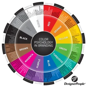
| Color Emotions and Associations | Colors evoke meanings: blue = trust; red = urgency; green = growth; orange = energy/action. Use associations to support the message. | Medium to High: Choosing the right color associations directs user behavior. |
| Core Design Principles | Balance, contrast for readability, harmony, accent CTAs, and brand color consistency. | High: Clear readability and recognizable brand signals improve CTR. |
| Applying Color Psychology | Define objective and audience; map color roles (background, text, CTA, accents); choose intentional palettes; ensure accessibility. | High: Purpose-driven palettes and accessible designs boost engagement. |
| CTA Testing & Optimization | Hypothesize color effects, run A/B tests, monitor context/placement, ensure accessibility. | High: Data-driven color choices improve CTR over time. |
| Practical Examples & Brand Consistency | Case-based guidance (e.g., blue header, white text, bright CTA) and the importance of maintaining brand-wide color language. | Medium: Consistency strengthens recognition and CTR across banners. |
| Checklist for Implementation | Define objective/audience; use psychology-informed palettes; ensure contrast; test CTAs; maintain brand alignment; document results. | High: Structured checks support reliable CTR improvements. |
Summary
The table above captures the core ideas from the base content about color psychology for banners, including how color choices influence perception, readability, and click-through rates, as well as practical guidelines for applying color theory, testing CTA colors, and maintaining brand consistency. The following conclusion summarizes these insights in a descriptive, SEO-friendly style.